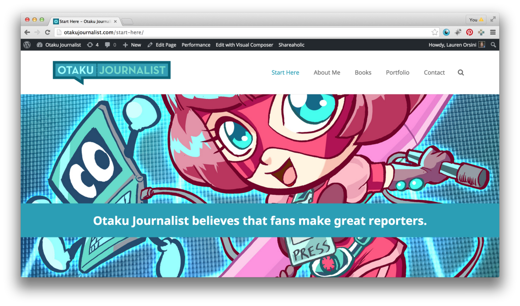
Here it is, Otaku Journalist’s long overdue overhaul. Today’s new look features a logo by Ben Huber and the Impreza responsive WordPress theme. It’s the most major design change I’ve made since I started the site.
The initial shift you might notice is a farewell to Otaku Journalist 2.0 and 3.0‘s sky blue #0099ff in exchange for the distinctly Caribbean #2b9eb5. This was Ben’s idea, in order to make the site match my pink-and-teal book covers. It’s going to take some getting used to, but I like the consistency.
Another big change is that Otaku Journalist is now serving as my portfolio site as well as my blog. My previous portfolio site, laurenraeorsini.com, now redirects here. Since I began working at Forbes, my work life and my hobbies have connected in a beautiful synchronicity, so I don’t feel the need to maintain a less geeky front to clients when it’s obvious I’m all geek, all the time.
The part I’m most excited about, however, is this new course I am offering. The Niche Reviewer Crash Course is a free, five-day email course you can complete at your own pace. You can get access to it simply by signing up for my newsletter. Find out more about it here.
Otaku Journalist has been around for almost six years and four redesigns, and I like to think its evolutions have been more than skin deep. Every iteration is a renewed effort to improve this site’s usefulness and encouragement. Here’s to the latest chapter.

