After I wrote my retort to the idea that “old anime is somehow better” last week, some of you remain unconvinced. I realized this belief goes far deeper than I thought.
“Anime was better before all this moe garbage,” say people who don’t realize that moe, a concept of cuteness that isn’t tied to an art style, has been around for ages.
“Each anime used to look unique,” say people who haven’t been paying attention to the clearly iconic art styles that characterize ‘80s, ‘90s, and ‘00s anime. This viral K-on image does a great job of quickly indicating the way a certain style characterized a decade.
Once again I believe that today, we have more variety than ever before as creators experiment with different visuals and pacing for anime. I asked on Twitter for suggestions for favorite unconventional looking anime, and everyone seriously delivered. Here are 10 fairly recent anime that have their own distinct look and feel.
Space Dandy
Forget anime with a different look. Space Dandy gives nearly every episode a distinct look. Classic Atomic Age inspiration soon gives way to a variety of experimentation. And at the end of each episode, it’s back to the sandbox.
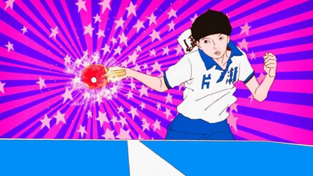
Ping Pong The Animation
Painterly backdrops and organic-looking line drawings give a fluidity to characters’ movements. This anime is overflowing with artistry and pays close and careful attention to motion and form.
Tatami Galaxy
It’s by the same director as Ping Pong but you wouldn’t know by the look, which is all its own. I like the simplistic wood-block appearance the first time I watched it. (Fun fact: I actually reviewed it for Japanator way back when.)
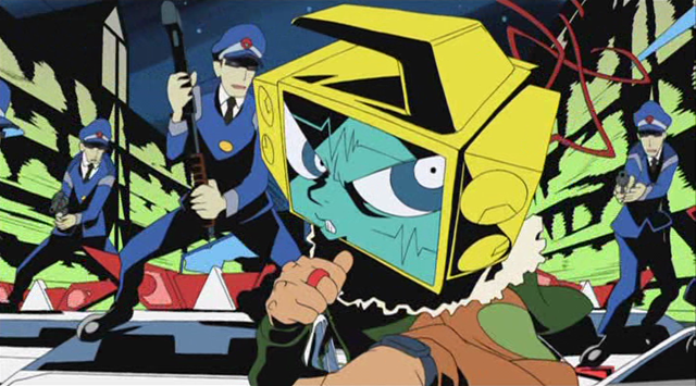
Panty, Stocking & Garterbelt
It may not look that different if you watched Cartoon Network in the late ’90s, but it’s definitely a break from the norm for anime. The juxtaposition of American cartoon bodies and crass violent and sexual themes is certainly jarring.
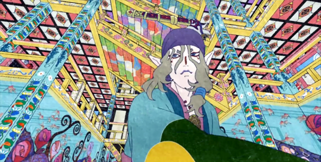
Mononoke
This supernatural horror was the first anime that came to mind. I just reviewed it and noted its “dizzying kaleidoscope backdrop of wild colors, elaborate Edo-period composition, and parchment paper texture.”
Flowers of Evil
This show used rotoscope animation—it animated traced frames from live action film. The resulting choppy realism is unsettling and deliberately slow, providing an ideal medium for a show in which a tense build-up is everything.
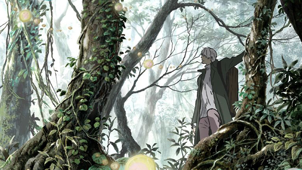
Mushi-shi
A lot of people recommended this one as an anime with a distinct look, more than any other. I think it’s because it also has a very distinct atmosphere, too. Muted colors and watercolor washed backdrops make for a mysterious take on the natural world.
Gankutsuou: The Count of Monte Cristo
 A little old but I don’t care, because those patterns are like richly colored origami paper. According to Wikipedia, the effect comes from Photoshop textures layered into digital animation, and the result is stunning.
Dead Leaves
There’s a reason people still watch this when the plot is just so-so, and it’s the unusual animation. It’s got a look like graffiti which exaggerated and bright, perfect for its crass, wannabe-edgy, urban future-punk plot.
Redline
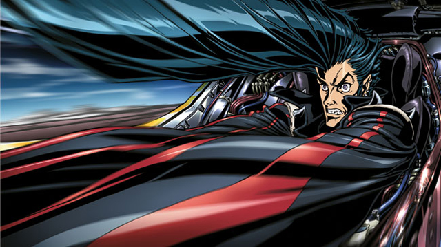
This movie looks more like superhero comics than a racing anime. Perhaps that’s because it’s entirely hand drawn in a time where most animation is digital. According to the DVD extras, it took 7 years and over 100,000 hand-drawn frames to make it, and it shows.
Of course, this selection is just scratching the surface. What’s your favorite uniquely animated show?




11 Comments.
So many of my favorites are already here! I would add, however:
Kick Heart
Lupin III: The Woman Called Fujiko Mine
Choyaku Hyakunin Isshu: Uta Koi
Folktales from Japan
Kids on the Slope (simply for the animation of the instrument playing)
Puella Magi Madoka Magica
@AnimatedInk:disqus oooh Folktales from Japan! Now THERE’S a variety of art styles.
Great list, Lauren. I’ve been meaning to check out Mononoke for the longest time, and you’ve given me more reason to do so.
I’ll also second Ink’s suggestion of Madoka. In a way, it’s the perfect anime to show that commenter on Facebook. Everyone talks about Madoka as deconstruction of the magical girls genre, but I also think it’s a visual deconstruction of the moe art style. A lot that is done through the scenes that involve witches, which take their visual cues from collage making and cubism—both of which themselves started as deconstructions of earlier visual styles—to create an aesthetic that looks completely unique within the anime medium.
Visual deconstruction of moe is almost right. It’s technically called “superflat,” a technique pioneered by Takashi Murakamii that mashes up the cute and the qrotesque in an effort to make the user question the difference between the real and the fantastic. The end effect is rather surrealist/absurdist though, and its application in Madoka is yet another element of the deconstruction of the magical girl genre.
Excellent list, and I should add that almost all of these are anime that are excellent by any stretch.
Also worth mention:
– “Trapeze” (Kuchu Buranko)
– Mind Game
– Tragedy of Belladonna (coming back out later this year in a gorgeous remaster!)
– Night on the Galactic Railroad
– Spring and Chaos
– Cat Soup
Oh, and The Diary of Tortov Roddle!
https://www.youtube.com/watch?v=i7F6cM_TMjI
There’s Katanagatari, which is very stylized in appearance. In fact, at times it reminds me of Samurai Jack, especially during a certain duel at a burning temple.
And I concur with The Woman Named Fujiko Mine, it looks 60s in all the best ways.
Actually, just show them 10 different episodes of Space Dandy and you’re set.
Given the plethora of different styles in the show … yes.
Also, Fuyu no Hi (Winter Days): https://www.youtube.com/results?search_query=winter+days+%2F+fuyu+no+hi
[…] Ten anime that don’t “all look alike” […]